In doing theme or plugin development, maybe you’ve noticed that the various browsers represent fields and inputs differently. Two recent projects, I ran into this inconsistency, and the client wanted everything uniform.
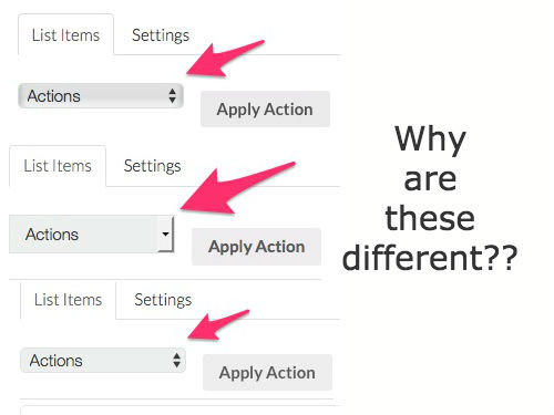
So, here’s what the different browsers represent a dropdown select:
Chrome:

Safari:

Firefox:

If you try and edit this in CSS with a simple change to the border-radius property, that’s not going to work. Also, you want to get rid of the different drop-down arrows (thanks for being so weird Firefox!).
So, what’s a dev to do??
Enter appearance: none !!
While you need to make sure you’ve got your vendor prefixes in there (see below for the full example), this will normalize/reset the styles for the select dropdown across all browsers.
Then, you can style as you like. Here’s the code I used below to get these styles working on https://akgoods.com:
select {
-webkit-appearance: none;
-moz-appearance: none;
max-width: 100%;
display: block;
height: 24px;
padding: 0 10px;
background: #fff;
overflow: hidden;
line-height: 22px;
font-size: 13px;
border-radius: 0;
white-space: nowrap;
text-overflow: ellipsis;
position: relative;
border: 1px solid #D5D5D5;
background-image: url(images/select-arrow.png);
background-position: 96% 50%;
background-repeat: no-repeat;
}
Some of this code was copied from another site (can’t remember where, in the heat of the moment, I neglected to cite my source!). However, this code, plus the background image, turns all select dropdowns into this:

Beautiful!